Split-level homes can sell beautifully, but the interior has to “read” clearly—both in person and in listing photos. The same features buyers love (separated zones, interesting levels) can also feel chopped up, dim, or dated if the flow isn’t obvious.
This guide focuses on split level house interior ideas that are high impact and low construction: better sightlines from the entry, lighting that fixes mid-landing shadows, and styling that makes every level feel intentional.
Think of each update through two filters: buyer perception (does it feel open and easy?) and photo-readability (does it look bright, simple, and cohesive on camera?).
What makes split-level interiors tricky (and what buyers notice)
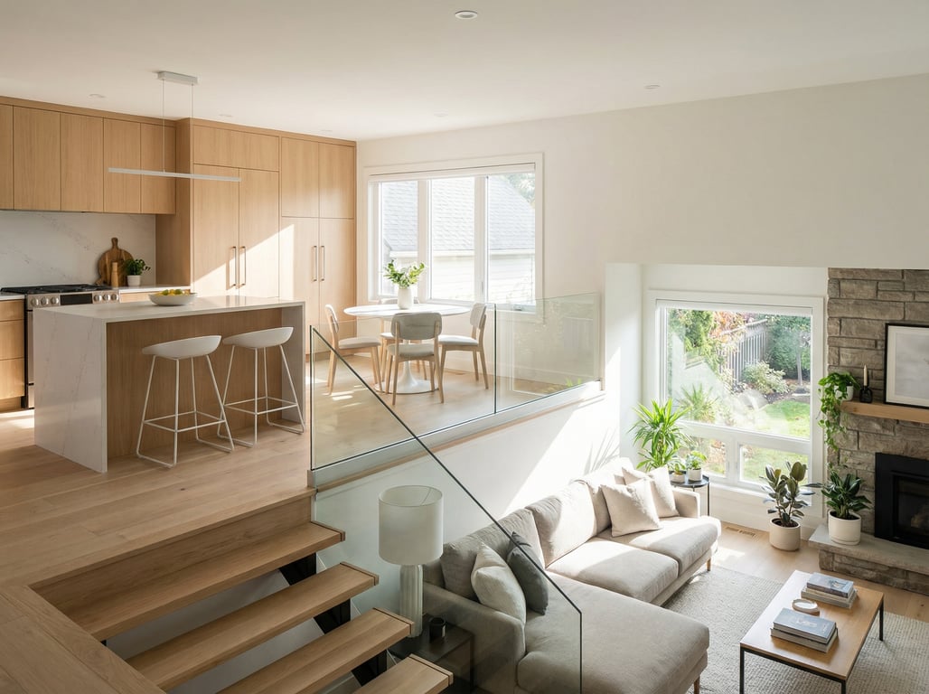
Sightlines from the entry
Split-level entries often create an instant “decision point”: up, down, or forward. If that first view is cluttered or visually noisy, buyers assume the whole home is cramped.
Use this quick checklist:
- Make the first 6–8 feet empty of furniture bulk. Avoid tall bookcases, big console tables, or oversized coat trees.
- Create a single focal line. A runner, a centered mirror, or one large piece of art gives the eye a destination.
- Reduce competing patterns. If the rug is bold, keep wall art and pillows simple (or vice versa).
If you’re unsure how “busy” it looks, stand at the front door and take a wide-angle photo. If the image feels chaotic, simplify until it reads in one second.
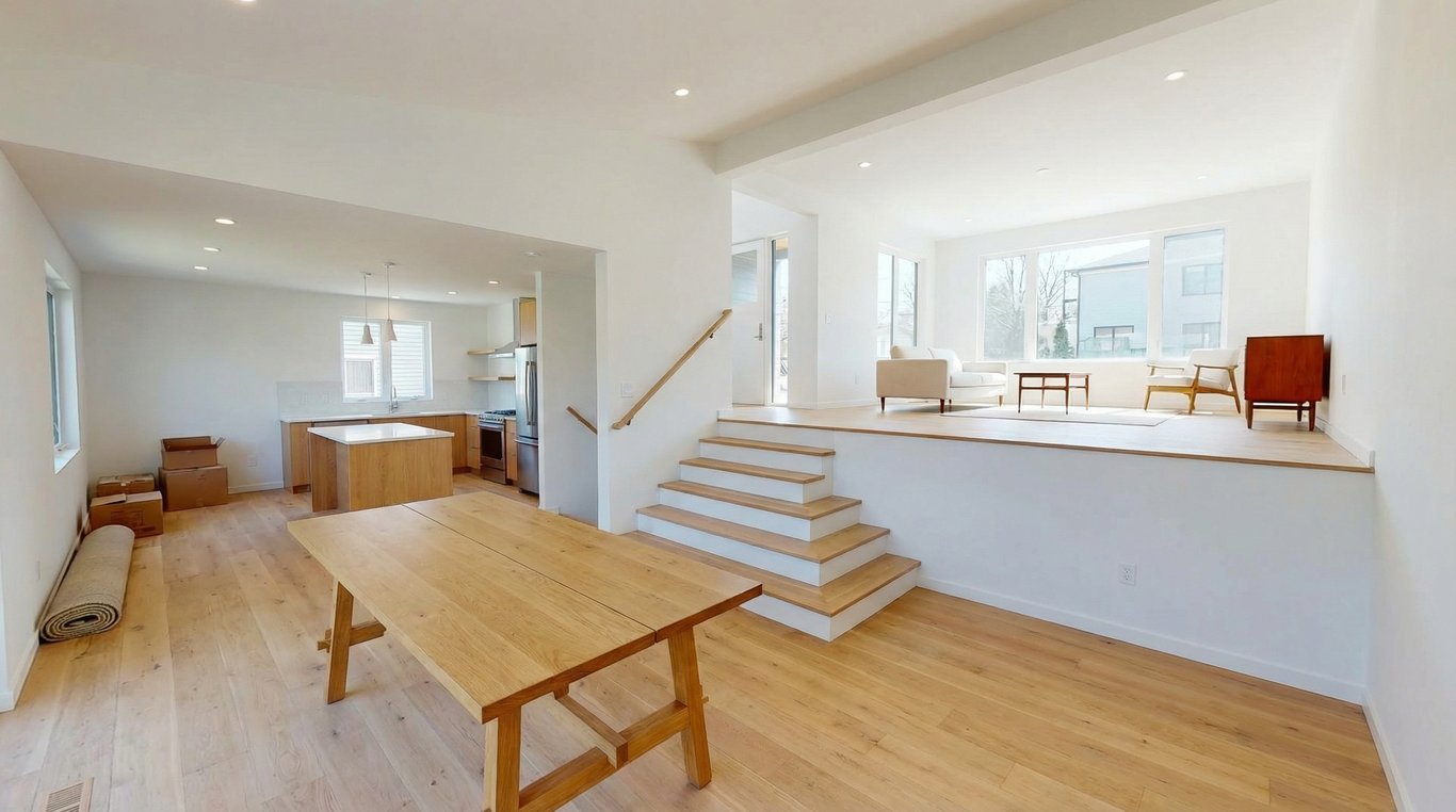
Low ceiling zones vs vaulted zones
Many split-levels mix ceiling heights—sometimes a half vaulted ceiling in the main living area and lower ceilings in the entry, halls, or lower level. Buyers notice the contrast, especially if:
- The low zones are painted dark or lit with a single overhead fixture.
- The vaulted area is visually disconnected (different wall color, trim, or flooring breaks).
A simple rule that photographs well: keep the low zones brighter and quieter, and let the taller room carry the “statement” (a larger light fixture, feature wall, or bigger art).
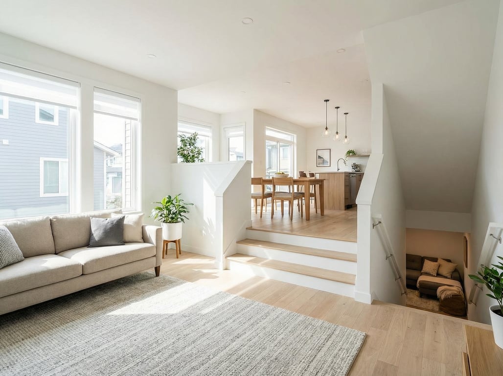
Lighting and stair placement
Stairs and mid-landings create shadow pockets that can make the home feel dim even with decent windows.
Common lighting problems in split-level interiors:
- One ceiling light trying to cover multiple levels
- Warm bulbs in one area and cool bulbs in another (photos look patchy)
- No light source at eye level on the landing
Fixing lighting is one of the most “before/after” friendly changes because it dramatically improves listing photos without moving walls.
High-impact, low-construction updates that photograph well
Paint + trim strategy to unify levels
When levels are visually segmented, the home can feel smaller. Paint is the fastest way to unify.
Photo-friendly approach:
- Choose one main wall color for all connected public zones (entry → stairs → living/dining). This creates continuity in photos.
- Use a consistent white (or near-white) on trim across levels so transitions feel intentional.
- Limit accent colors to one per floor (e.g., a deeper tone only in the lower family room).
If you want a more modern look, lean into a simplified palette and fewer decorative “breaks.” A good style reference is clean lines interior design, which pairs well with split-level architecture because it reduces visual clutter.
Lighting layers for mid-landing and lower level
Aim for three layers: overhead + task + ambient.
Practical upgrades that don’t require major wiring:
- Entry/mid-landing: add a plug-in sconce or a slim table lamp on a narrow console (yes, even a small surface helps).
- Lower level: use two lamps on opposite sides of the room to “flatten” shadows in photos.
- Bulb consistency: keep bulbs the same color temperature throughout public areas (2700K–3000K is usually most welcoming).
Listing photo tip: turn on every lamp for photos, even during daytime. Mixed natural + lamp light often makes lower levels look more livable.
Railing/banister refresh for a modern first impression
Buyers touch and see the railing immediately, and dated rails make the whole home feel older.
Low-construction refresh ideas:
- Paint railings/wood spindles a single color for a cleaner look.
- Replace only the handrail (often cheaper than a full stair rebuild).
- If you have thick, ornate spindles, consider simpler replacements to improve sightlines.
Avoid anything that reads “DIY heavy” up close; railings are photographed and inspected closely.
Layout and zoning ideas by level
Entry/landing: drop zone that doesn’t clutter photos
A drop zone is essential, but it has to be shallow and contained.
Options that stage well:
- Slim bench + 2 baskets underneath (hides shoes fast)
- Floating shelf + hooks (keeps the floor visually open)
- One tray for keys/mail (avoid piles)
Sizing guide:
- Keep entry furniture under ~12" deep when possible.
- Leave a clear walking path that’s obvious in a wide shot (buyers should see where to go).
Upper level: bedrooms/hallways—how to keep cohesive style
Upper levels often photograph like a different house if finishes and decor shift too much.
Cohesion checklist:
- Repeat one metal finish across door hardware, lights, and mirrors.
- Use the same wall color in the hallway and adjacent bedrooms (or keep the hallway lighter as a “connector”).
- Keep bedding simple and high-contrast (white/neutral bedding reads clean in photos).
If the hallway is tight, reduce visual interruption: fewer frames, larger pieces, and no floor clutter.
Main level: living/dining—open-feel tricks without removing walls
You can’t always open a split-level without permits. You can still make it feel open.
Try these “no wall removal” ideas:
- Rug zoning: one large rug that fits the main seating area makes the room feel bigger than multiple small rugs.
- Sightline furniture: choose lower-back sofas/chairs to keep views across the room.
- Consistent window treatments: hang curtains high and wide to make windows look larger.
- Dining clarity: use a table shape that matches circulation (round tables often improve flow near stairs).
If a half wall blocks the kitchen view, treat the top like a “visual shelf”: minimal objects, one plant, one bowl—nothing more.
Lower level: family room/bonus—make it feel bright and purposeful
Lower levels often fail listings because they feel like a cave or a storage area.
Make it read as a destination:
- Assign one purpose: TV lounge, office nook, gym corner, or guest space. Don’t stage it as “everything.”
- Use lighter, warmer neutrals and add texture (a bright rug, light throws) to counter low light.
- Create height: tall curtain panels (even if windows are small) and vertical art help offset lower ceilings.
If the ceiling is low, keep ceiling fixtures slim (flush or semi-flush) and move the “cozy” to lamps.
Stair and hallway styling that improves flow
Runner + wall art scale guidelines
Stairs are a strong visual line—use them to guide the eye.
Runner tips:
- Pick a pattern that won’t moiré on camera (medium scale > tiny busy prints).
- Choose a tone that hides wear but doesn’t darken the staircase.
Wall art sizing tips:
- One large piece often looks calmer than a gallery wall in a tight stairwell.
- Hang art so the center aligns roughly with eye level along the stair path (not the landing only).
Mirrors for light bounce
Mirrors are one of the best split level house interior ideas because they help both perception and photography.
Where mirrors work best:
- Opposite a window in the main living space
- At the mid-landing to bounce light down into the lower level
- In narrow upper hallways to widen the feel
Choose a simple frame so it doesn’t become visual noise.
Avoiding visual ‘busy-ness’ for listing photos
Split-levels already have architectural “movement.” Too many small decor items compete with that.
Photo-readability rules:
- Group decor in sets of 2–3 (not 7–9 scattered items).
- Limit patterns to two per room (e.g., rug + pillows).
- Hide cords and routers; they stand out on landings and media consoles.
Common split-level ‘before/after’ scenarios to visualize
Outdated paneling → bright modern family room
Before: dark wood paneling + one ceiling light + bulky entertainment unit.
After (low construction):
- Paint paneling a warm white or light greige to reflect light.
- Add two lamps on opposite sides of the room.
- Swap to a lower media console and mount art above it (or keep the TV balanced with side decor).
This “after” photographs brighter and makes the lower level feel like livable square footage.
Closed-off kitchen sightline → lighter, connected feel
Before: you enter and see a blank wall; kitchen feels hidden.
After ideas without removing walls:
- Use a lighter wall color in the entry and kitchen to visually connect them.
- Add a mirror or art at the end of the entry sightline to pull the eye forward.
- If there’s a pass-through/half wall, keep the counter mostly clear and add one statement pendant above the kitchen side.
Dark lower level → multi-source lighting + color palette
Before: one overhead light, dark walls, and furniture pushed against every wall.
After plan:
- Add layered lighting (overhead + 2 lamps + optional floor lamp).
- Choose a palette that reflects: warm whites, light taupes, soft grays, and natural textures.
- Float furniture slightly off walls to create breathable pathways.
If you want to test different “after” options quickly for staging or renovation planning, an AI decorating app can help you visualize layout and finish combinations before you buy anything.
Key takeaways
- Keep advice broadly applicable; avoid structural/permit-heavy recommendations.
- Tie each idea to buyer perception and photo-readability.
- Use clear subheadings for featured snippet potential (problem → solution).
FAQ
How do you make a split-level house feel more open?
Unify paint and trim across connected areas, lower visual clutter at the entry, and use layered lighting (especially on landings). Choose low-profile furniture to preserve sightlines.
What colors work best in a split-level with low light?
Light, warm neutrals that reflect: warm white, cream, light greige, and soft beige. Keep undertones consistent across levels so transitions don’t feel choppy.
How do you stage a lower level for listing photos?
Give it one clear purpose (family room, office, gym), brighten it with at least two lamps, and keep decor minimal. Use a light rug and vertical elements (curtains/art) to counter low ceilings.
Split level vs tri level: what’s the difference?
A split-level typically has staggered floors connected by short stair runs, often with three main zones. A tri-level is a common split-level subtype with three distinct levels; see what is a tri-level home for a clear breakdown.